Sam & Sean
The Grounds
Design
Early Days
CATEGORIES
Search
Read more about our home projects, family, and things we've learned along the way. Sign up for our email list and never miss an update!
Hey there. Thanks for popping in!
THE BLOG
guys, it's
Exterior
June 4, 2024
Battle on the Beach | Kitchen and Dining Reveal
Filed in: Battle on the Beach

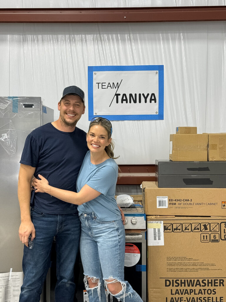
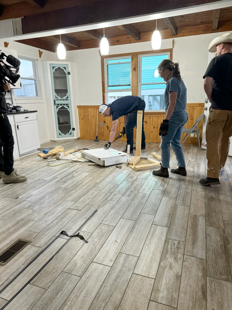
The battle of the kitchen and dining rooms is in the books. That’s a wrap for week one! Our first week on the beach was definitely a whirlwind to say the least. I can’t say we exactly have this whole “quick decision thing down” yet – truthfully I don’t know that we ever will haha.
KITCHEN DESIGN
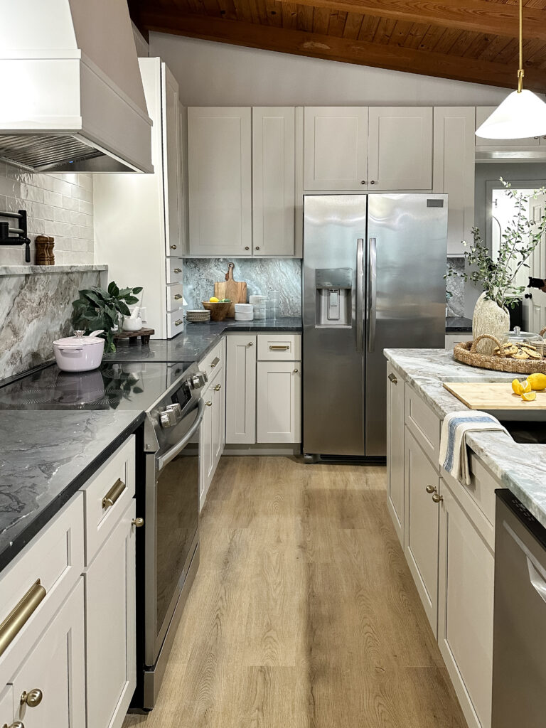
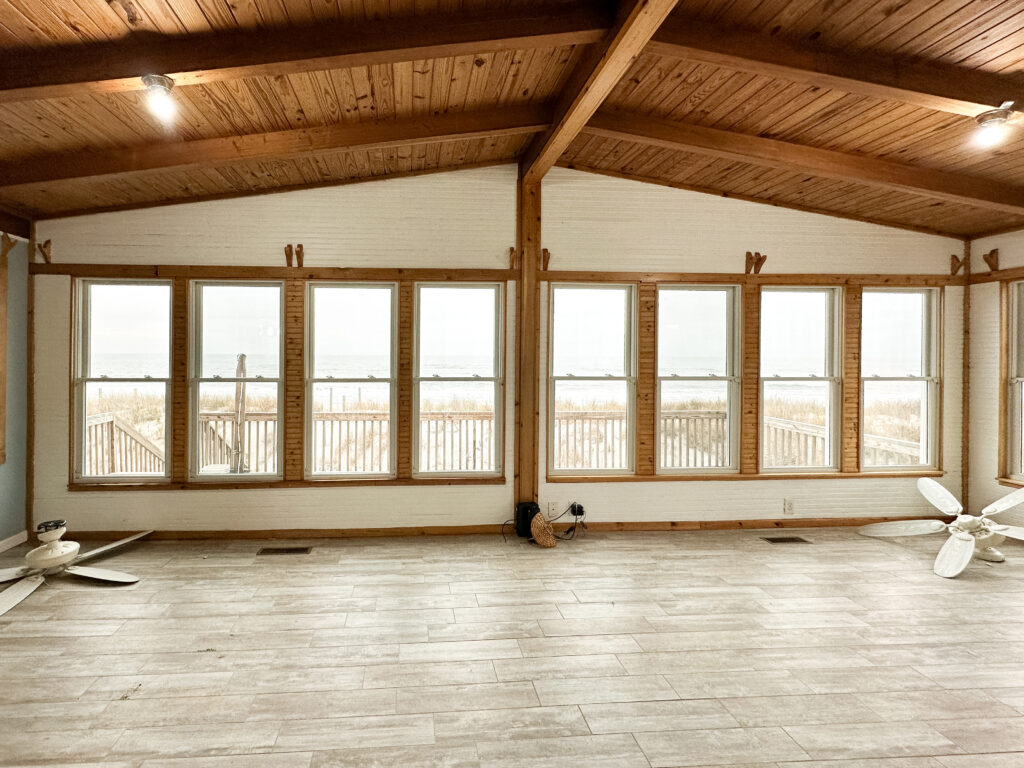
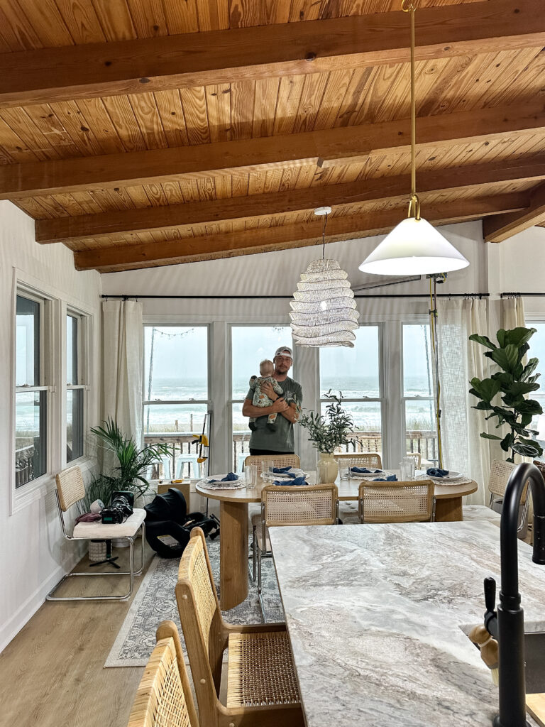
The kitchen sets the tone for the rest of the house, and we reallyyy wanted to go BIG. Our biggest hurdles were making the kitchen function property, have it be a show-stopping focal point when you entered the house, andddd make the most out of our beachfront view! Since the kitchen was located on the opposite side of the house from our wall of windows, we knew we had to move it to a more central location. Making sure you could still see the ocean while you were sitting at the island was a huge factor, so we knew pretty quickly how the new kitchen would be laid out.
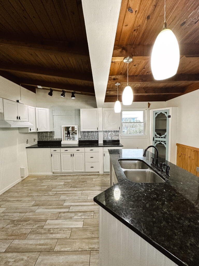
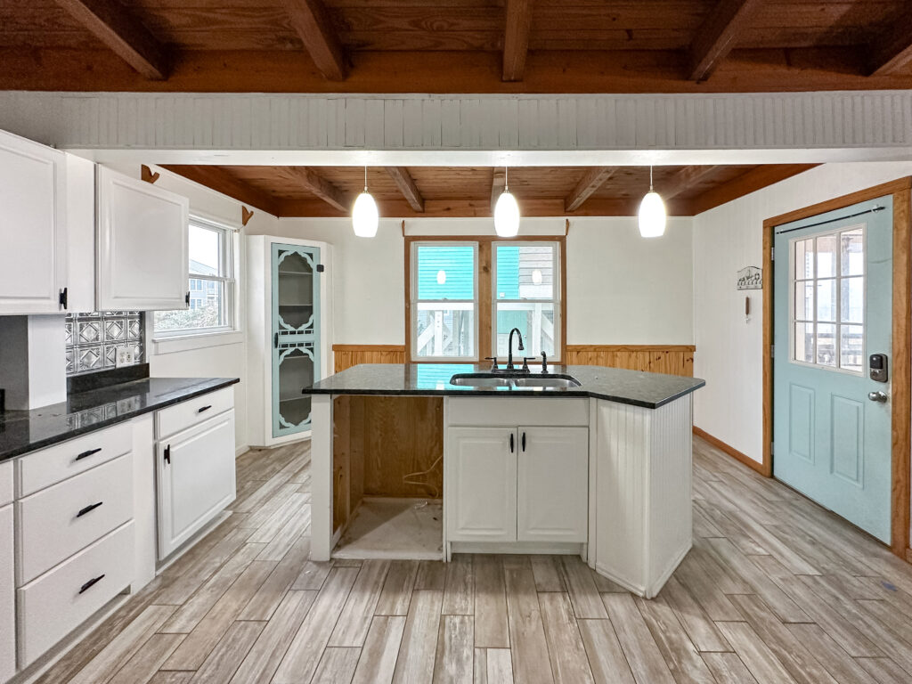
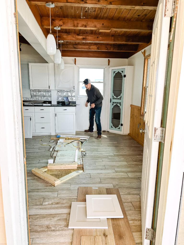
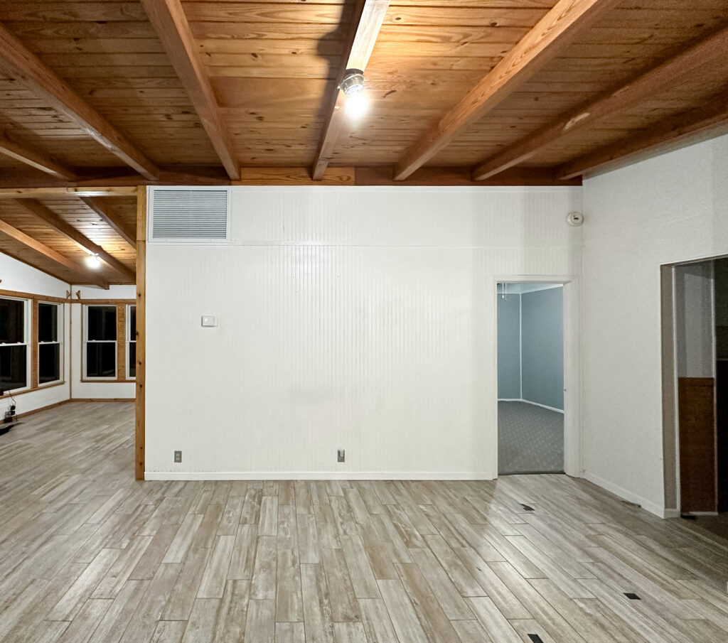
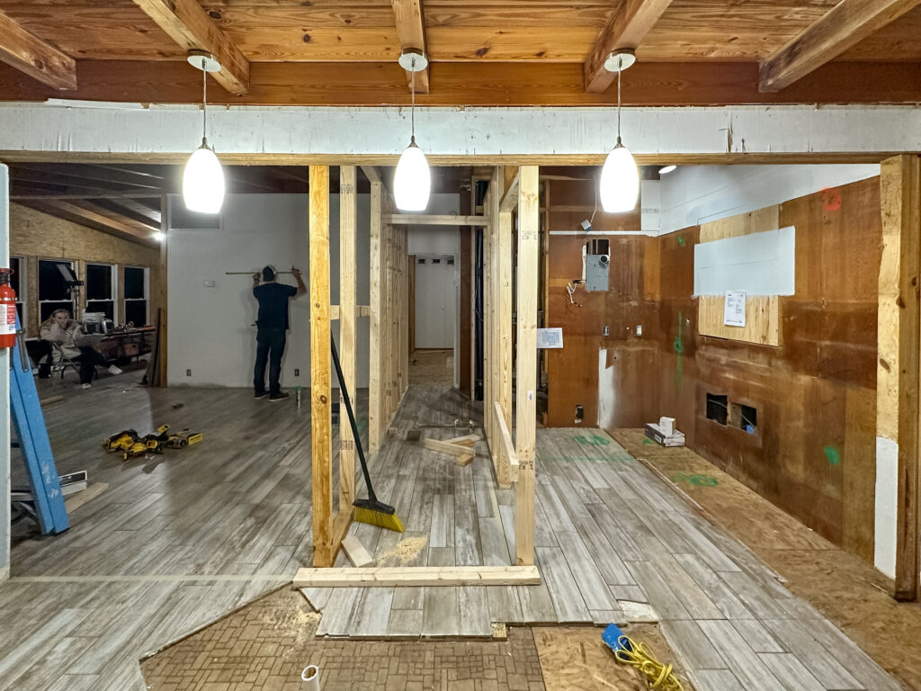
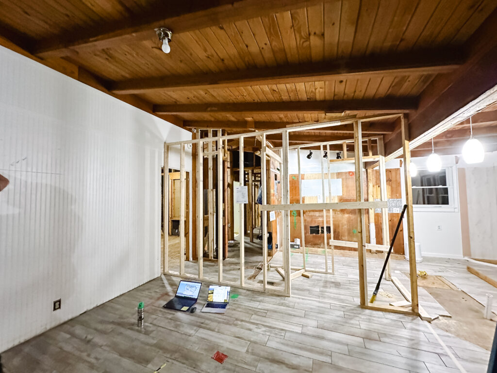
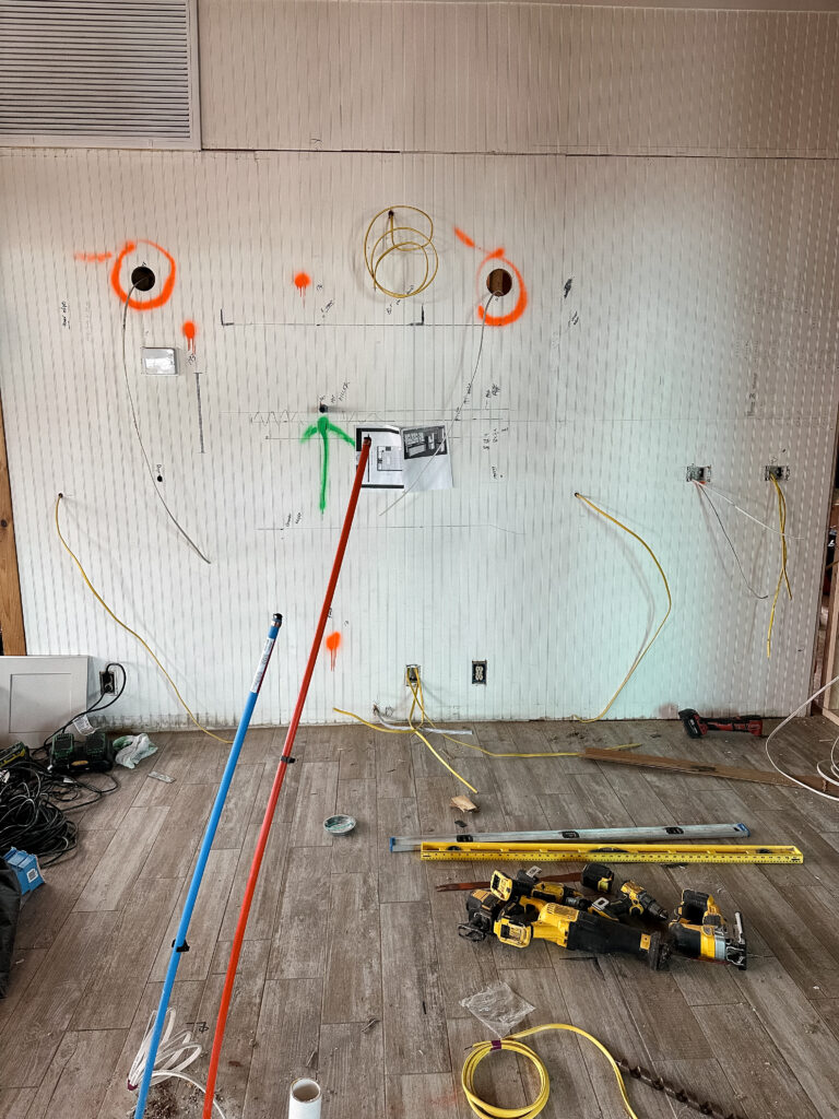
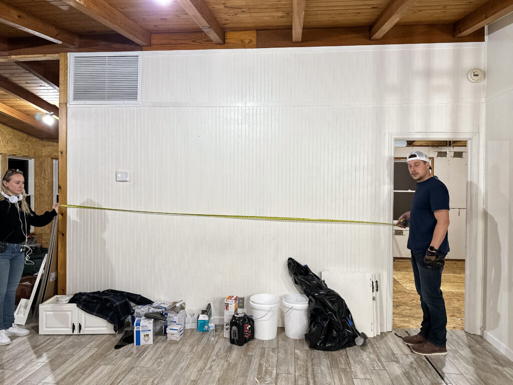
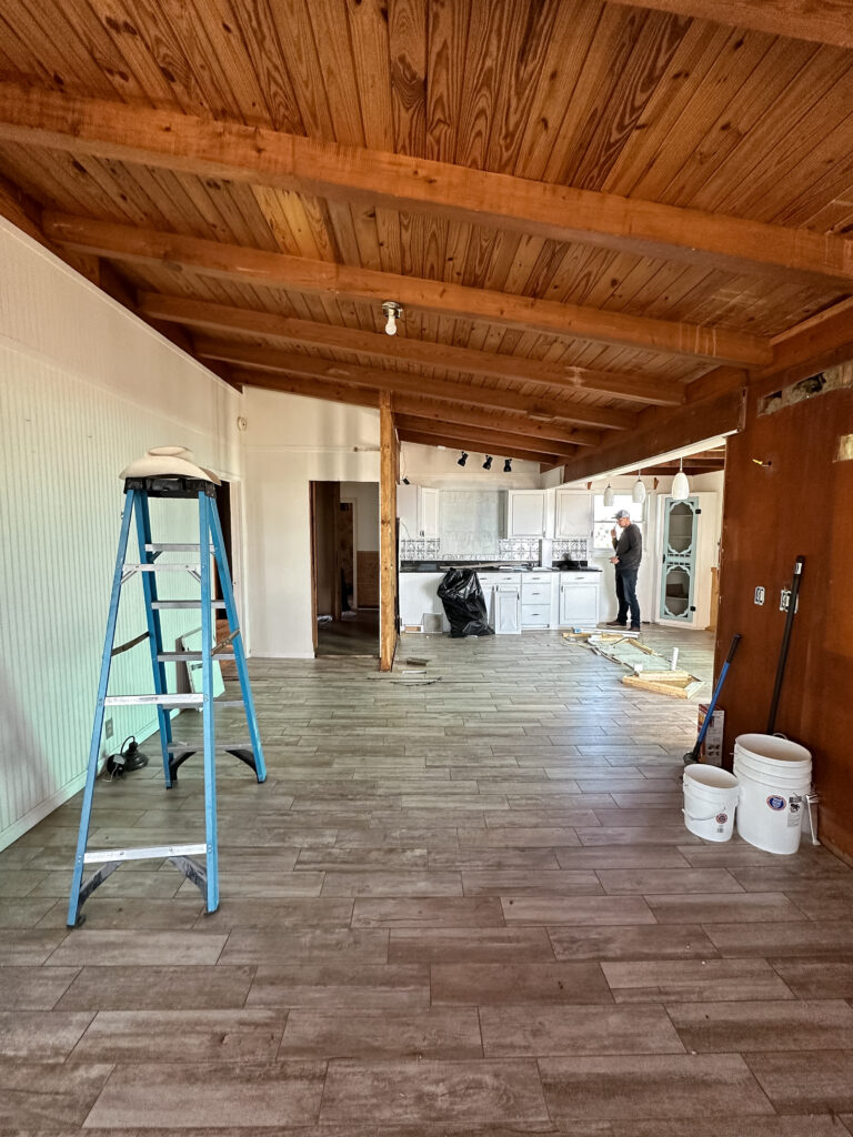
Most people take down walls during a remodel – but here we are putting them up!
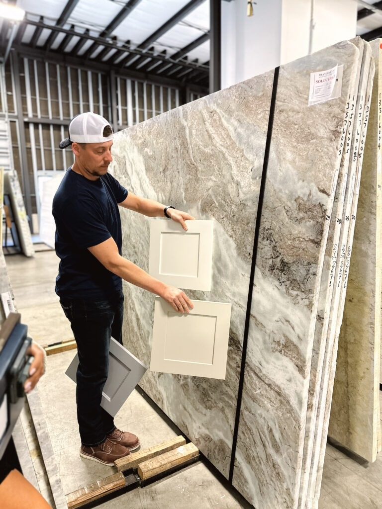
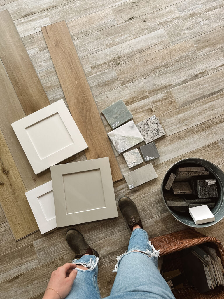
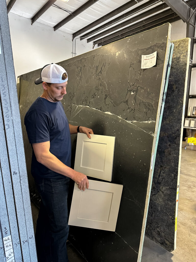
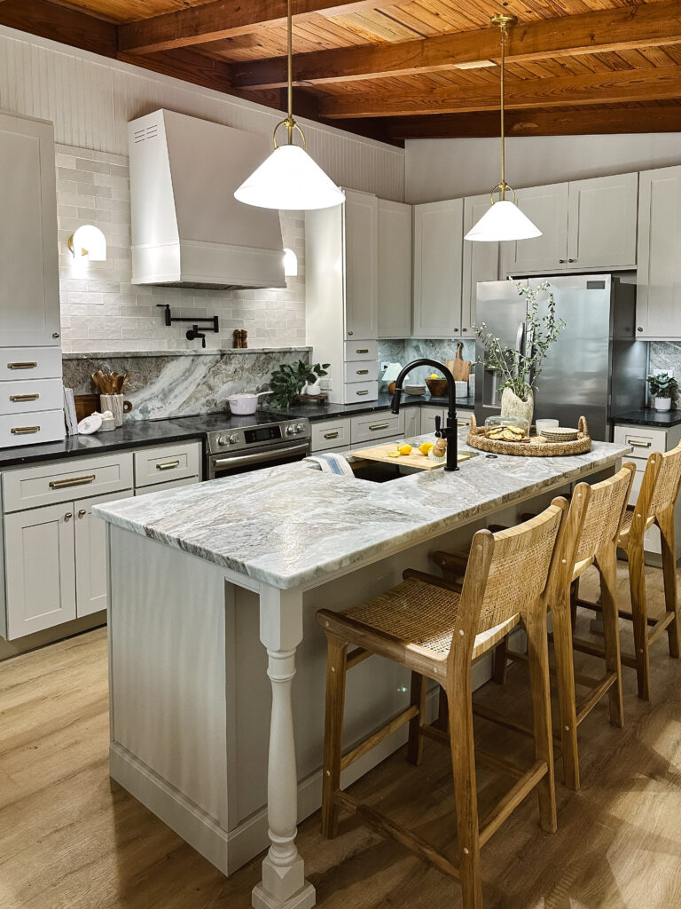
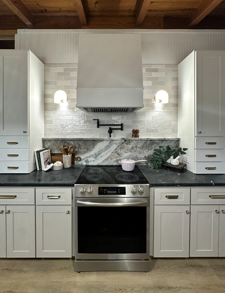
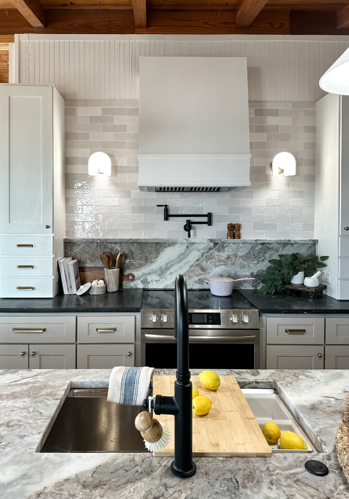
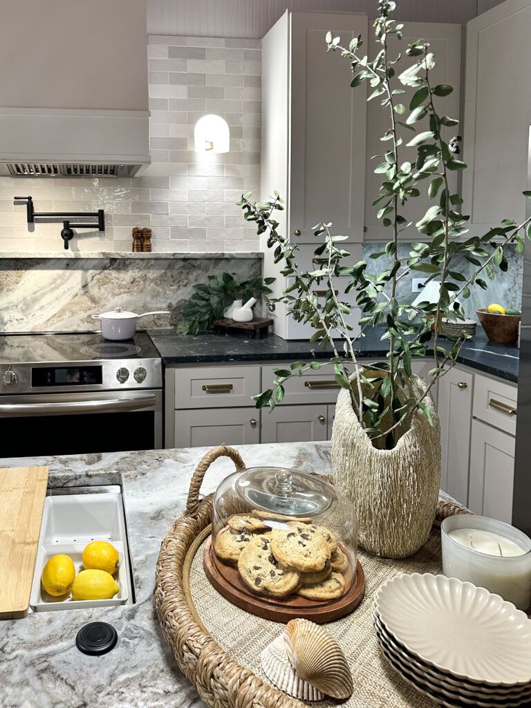
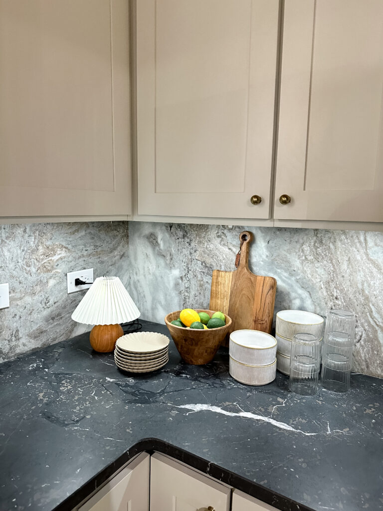
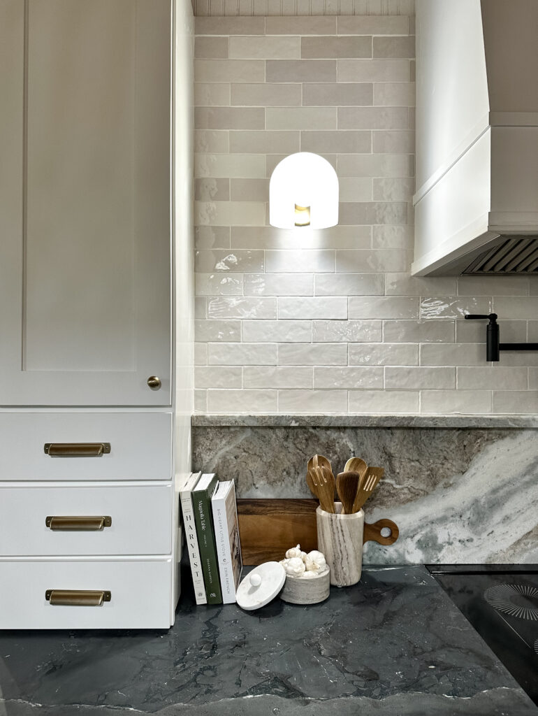
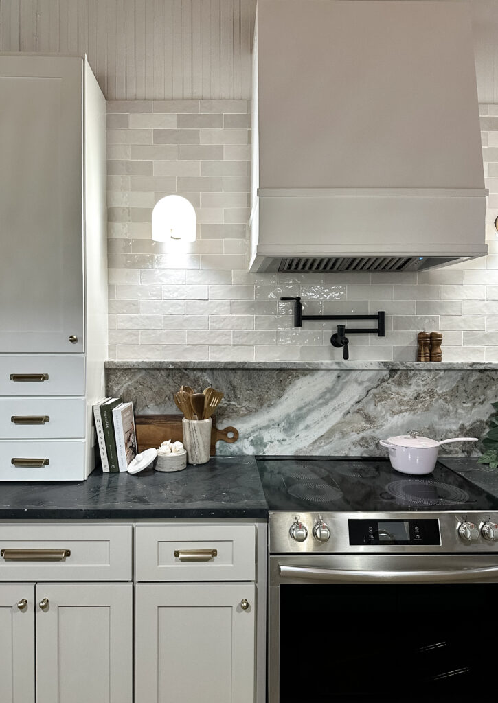
With having to get cabinets so quickly, we knew our options would be a little limited. We found “sand shaker” cabinets, and the idea of a sand color sounded perfect for a beach house. We opted for sand as the lowers, with white uppers to keep things not feeling too heavy up top. Countertops were next, and we were hoping for anything except stark white. We set our eyes on a slab of fantasy brown marble and it reminded us of the beach – it was perfect. We used this same slab for our backsplash, BUT kept our perimeter countertops dark (using black diamond quartzite) to help our cooktop blend in. Dark countertops with a light backsplash sounded crazy. I know. But I think it turned out incredible! Both types of countertops have a honed, leathered finish that give them the feeling they’ve been in the house for ages.
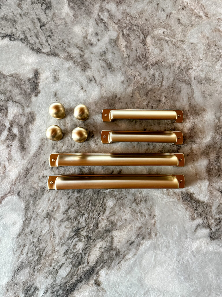
Once cabinets and countertops were in, we focused on the jewels of the kitchen – hardware and lighting. We went with Kohler a faucet, pendants, pot-filler and a multi-task sink. We even added sconces on our focal wall on either side of the vent hood for a high-end touch. We installed a zellige subway tile detail on our range wall to add one more layer of texture to the kitchen. Brushed brass hardware was the perfect finishing touch to tie it all together.
DINING ROOM DESIGN
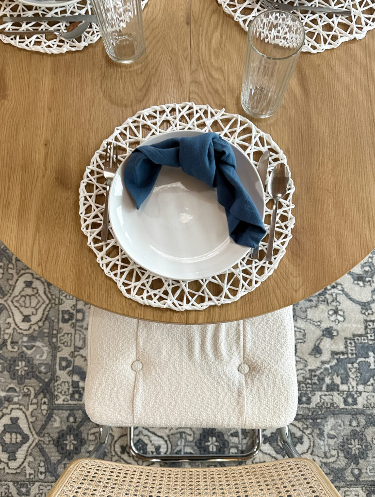
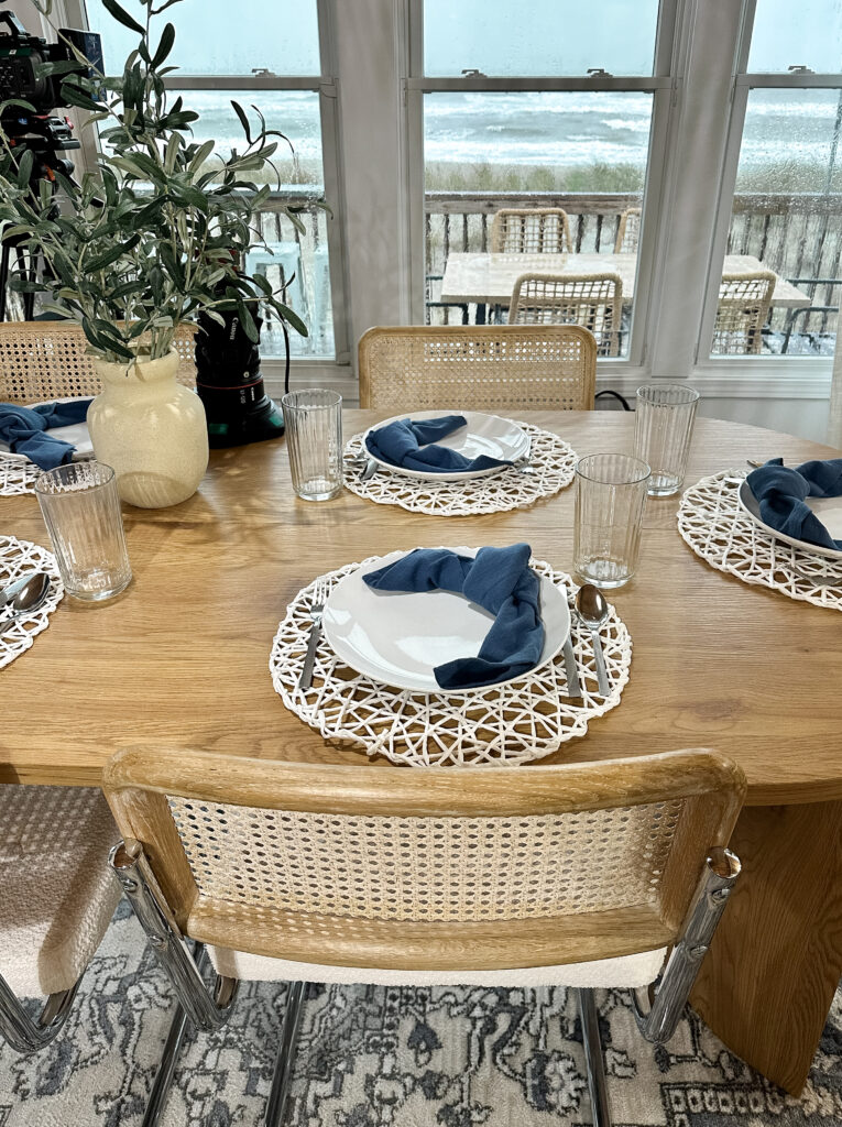
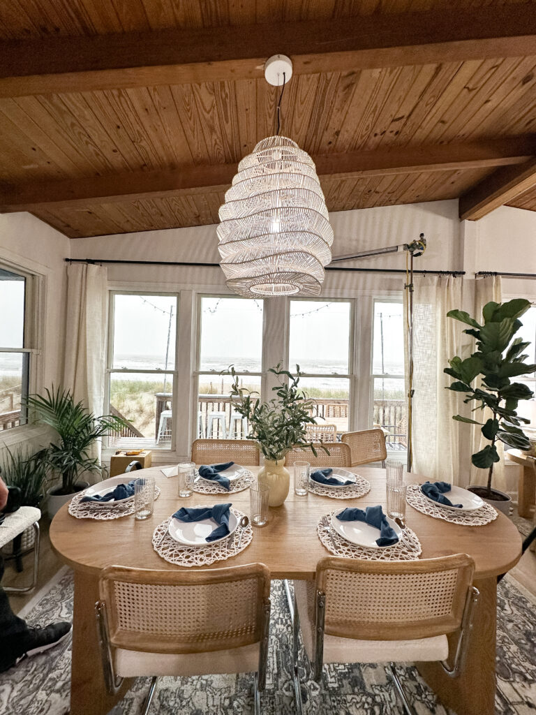
I think our family is one of the few that actually use their dining room, so we really wanted to make the most out of this space. Not to mention when you are on vacation and renting a beach house, we knew this home would host multiple people at once, and enough space for everyone to sit and eat together would be a necessity. We kept going back to making the most out of our ocean view, and this space was no different. We situated our dining room between the kitchen, and what will be our living room – with a perfect oceanfront view. We knew we wanted to incorporate some curves into this space to soft things up from our more rigid kitchen design, so we chose a pill-shaped, wood dining table. Upholstered chairs helped soften things up. The cherry on top was our statement light fixture. This had to be a different material and shape from our kitchen pendants so things didn’t feel too matchy and repetitive.
FINAL THOUGHTS
We love how our kitchen and dining room turned out, and we’re proud of the risks we took along the way. It fit our Hampton’s cottage vibe, and we really wanted it to feel like approachable luxury. High-end, but that you could kick your shoes off and stay for a glass of wine – or three. We’re still shocked we did SO MUCH WORK, two rooms and a massive kitchen move, all in one week! We can’t wait to show you what we are cooking up for next week – tell us your thoughts in the comments below!!
KITCHEN SOURCES:
- Sconces
- Pendants
- Counter Stools
- Cabinet Knobs
- Cabinet Pulls (Small)
- Cabinet Pulls (Large)
- Tile
- Sink
- Faucet
- Pot Filler
- Garbage Disposal Switch
- Under Cabinet Lights
- Vent Hood: Hoodlsy
- Wall Paint: Sherwin Williams Alabaster
- Countertops: Francini Inc. // Fantasy Brown Marble // Diamond Black Quartzite
- Cabinets: RTA Cabinet Store // Weston Sand Shaker // White Shaker
DINING SOURCES:
- Dining Table
- Dining Chairs
- Rug
- Large Pendant Light
- Placemats
- Plates
- Silverware
- Cups
- Napkins
- Fake Plant
- Curtains
- Curtain Hook
- Curtain Rod
- Wall Paint: Sherwin Williams Alabaster
STYLING ITEMS:
- Cookbooks: Big Heart Little Stove, Magnolia Table 3, Half Baked Harvest
- Tea towels
- Marble container
- Marble utensil holder
- Wooden scrub brush
- Counter lamp
- Mortar and pestle
- Faux plants
- Salt and pepper shakers
- Sauce pan
- Wood cutting board
- Wood kitchen utensils
- Wood serving bowl
- Woven round serving tray
- Scalloped plates
- Cookies canister
- Coffee canister
- Glass cloche

Loved watching your ideas come to life last night! Great work!
Thank you so much! The vent hood definitely helped tie it all together!