Sam & Sean
The Grounds
Design
Early Days
CATEGORIES
Search
Read more about our home projects, family, and things we've learned along the way. Sign up for our email list and never miss an update!
Hey there. Thanks for popping in!
THE BLOG
guys, it's
Exterior
June 11, 2024
Battle on the Beach | Main Suite Winners!
Filed in: Battle on the Beach
The process behind our WINNING MAIN SUITE! It’s week two on the beach and the battle of the main suites was INTENSE! We thought the kitchen took a lot of planning to re-work, but this week was no different. Neither of the two bathrooms we started with were connected to a bedroom, so to make a true en suite, we had a lot of work ahead of us. Both of our bathrooms we’re similarly laid out, and measured in at a whopping 5’x6′. We knew neither of these would work to make a win-worthy main suite, so we got to work!
We loved the idea of converting a bedroom into a bathroom to make one huge suite – BUT we knew all of the houses were starting with the same specs of 4 bedrooms and 2 bathrooms. If we got rid of a bedroom, could this end up costing us the big win in the end when it comes down to the appraisal? We were super nervous about this, but trusted Taniya’s guidance and went for it.
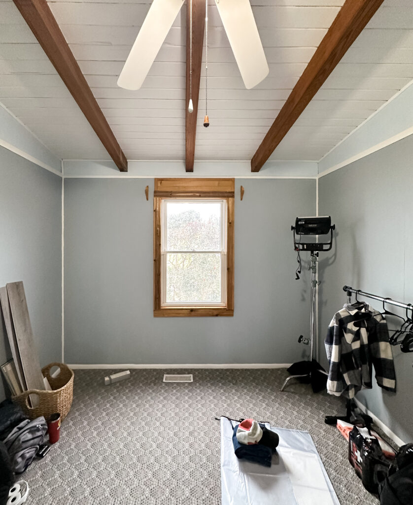
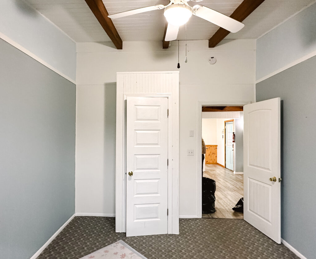
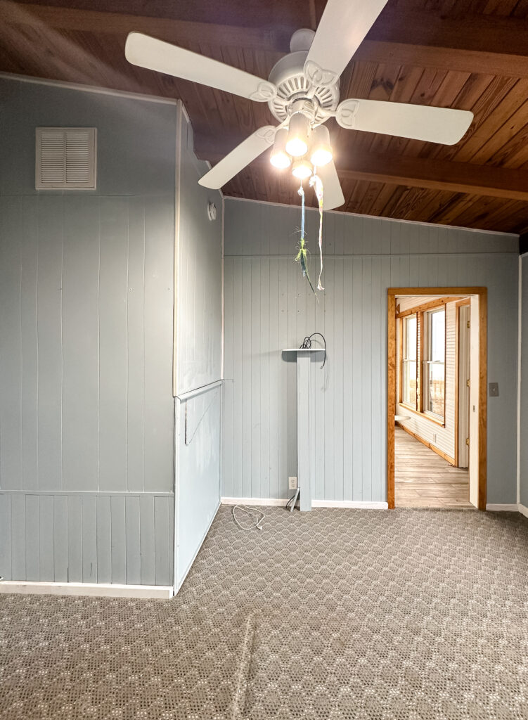
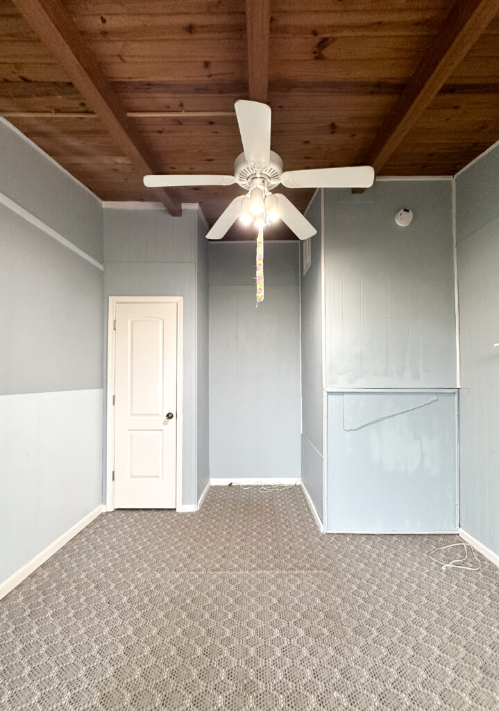
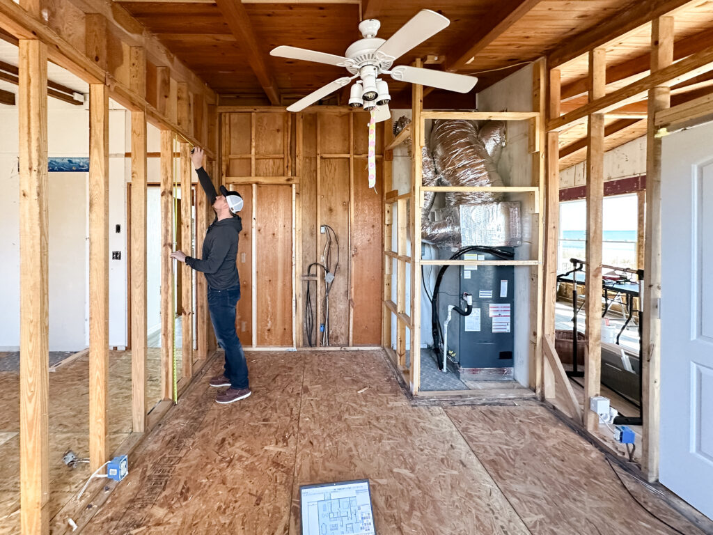
We closed off one of our bedroom doors that was previously accessible through our living room, and opened the wall up between two of our bedrooms to make space for a new door. Ultimately, this put all of our bedrooms on one side of the house – and our kitchen, dining and living room all on the other. We really liked the idea of how the house would function as separate entertaining and sleeping portions.
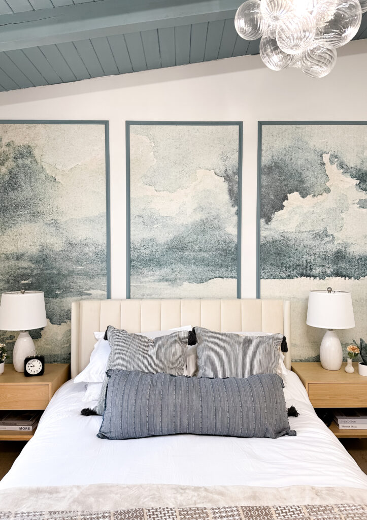
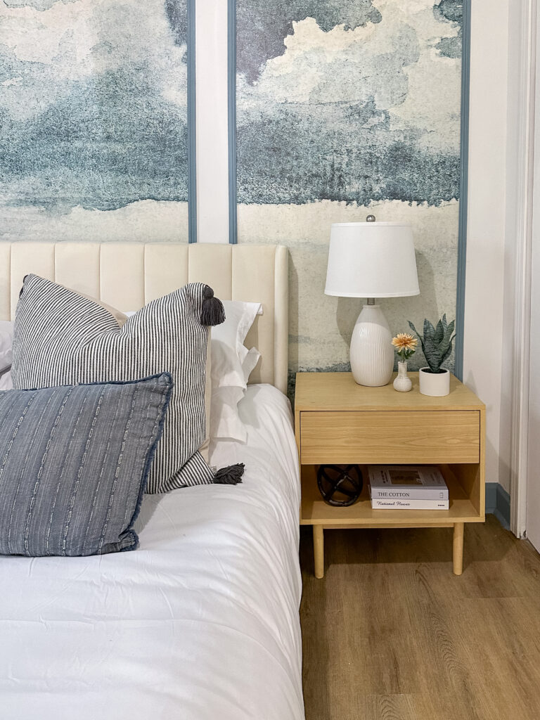
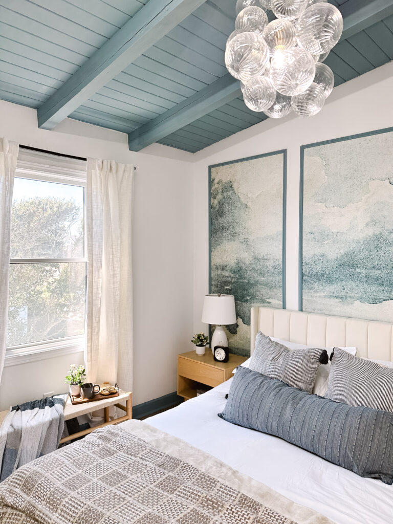
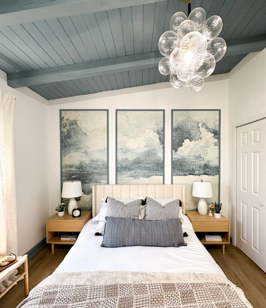
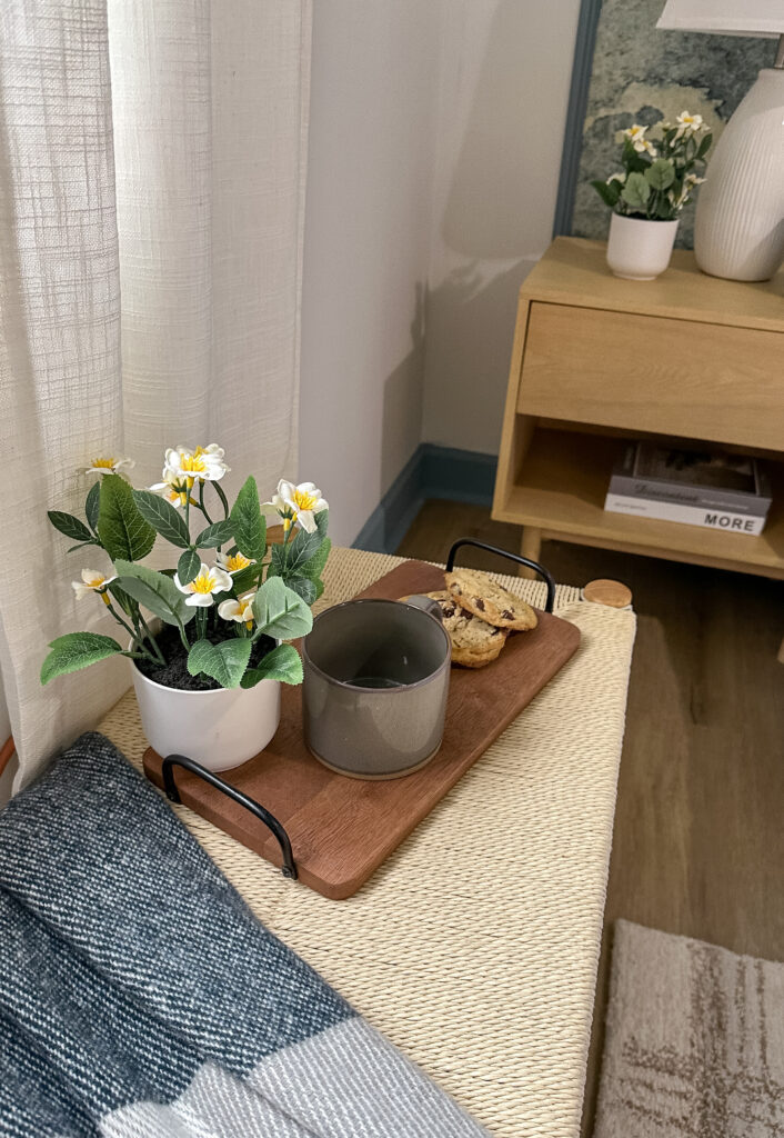
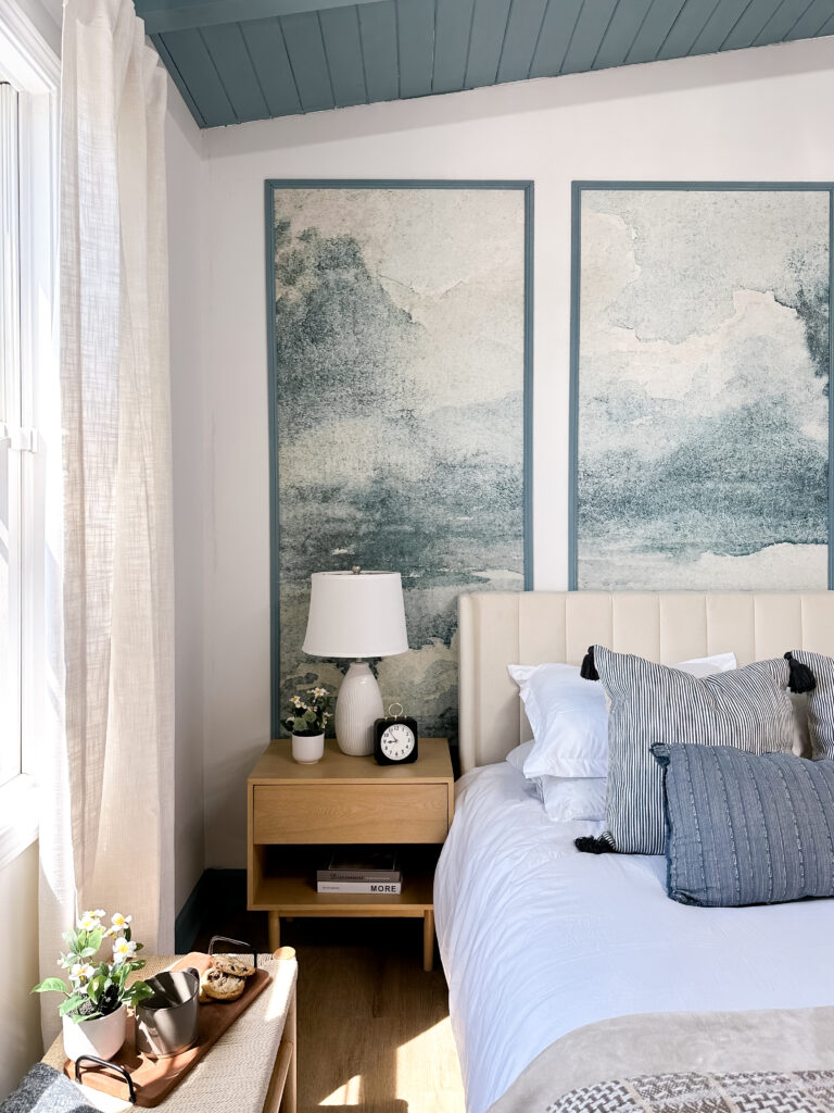
For our bedroom we already had a partially painted ceiling, so we leaned into that and repainted it a moody sea blue to draw your eye up. We did matching blue trim as an unexpected detail to make things pop and add some visual interest. A coastal wallpaper mural, broken up into panels was the perfect “wow” moment for our main headboard wall. We capped things off with a glass bubble light, and a neutral headboard and furnishings to keep the focus on our feature mural and blue ceiling.
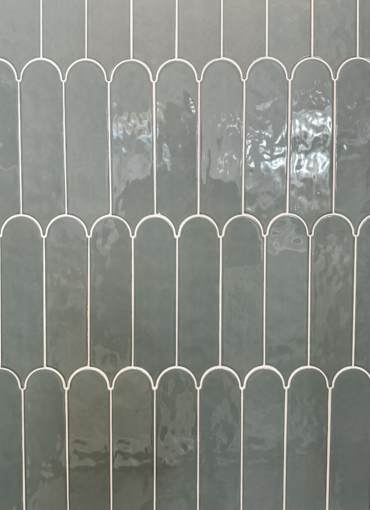
Since we were turning an old bedroom into our new bathroom, we were really starting from scratch. Helloooo blank canvas! We knew we had to have a double vanity and this was the one space we could splurge on a freestanding tub. For the finishing touches we wanted this room to really feel like an oceanside spa. We went with a feature wall behind our double vanity that had a sage green palm patterned wallpaper. A rattan light over our freestanding tub and dual oval mirrors added some visual interest. A separate shower with green oval tiles that played off of our mirrors made our five-piece bathroom have all the bells and whistles.
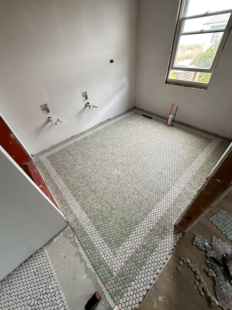
The last item to figure out was our floor tile. We went a little outside the box and carried our sage green tones into the flooring. We bought all of the green penny tile the store had in stock, BUT it wasn’t enough. We were able to use white penny tile for our space by the toilet, and our door threshold. We had the really cool idea to add a white border in our green tile that traced the room. It gave the feel of custom tile work that elevated the space, but was super cost effective.
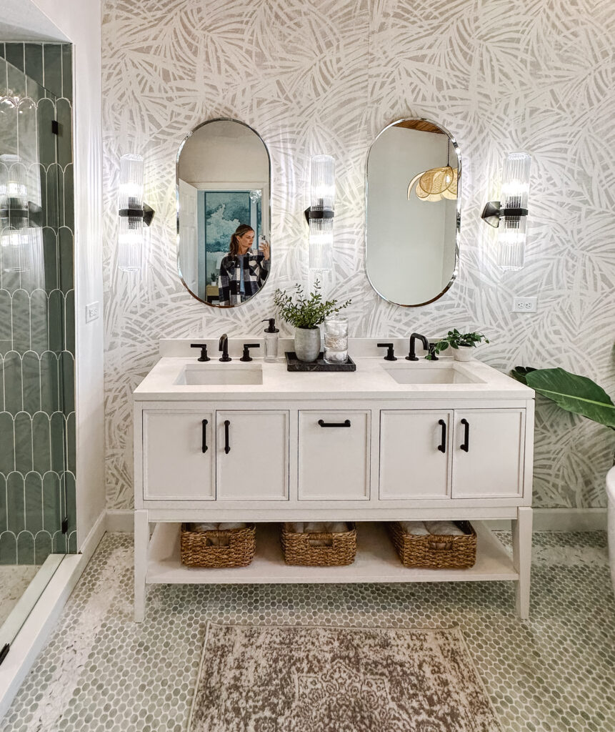
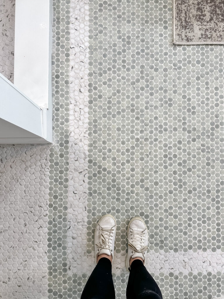
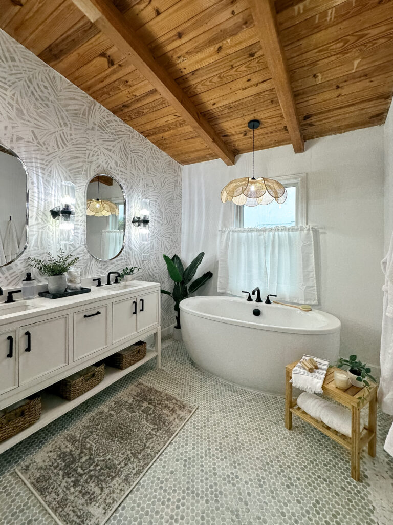
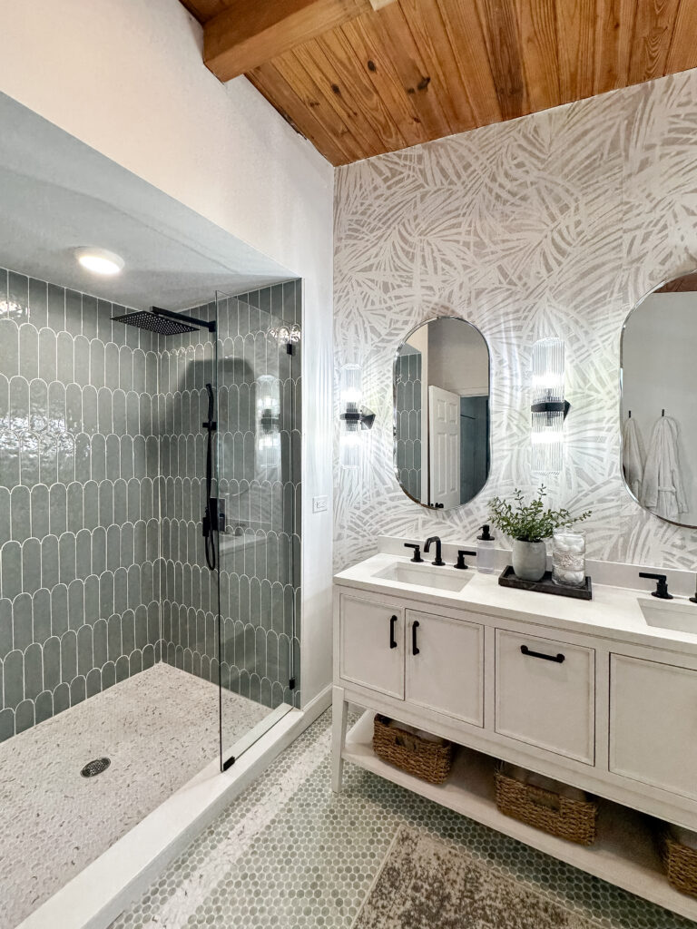
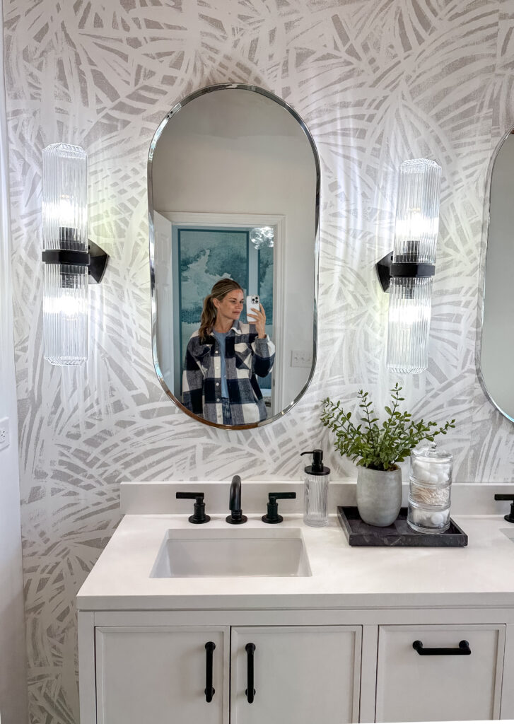
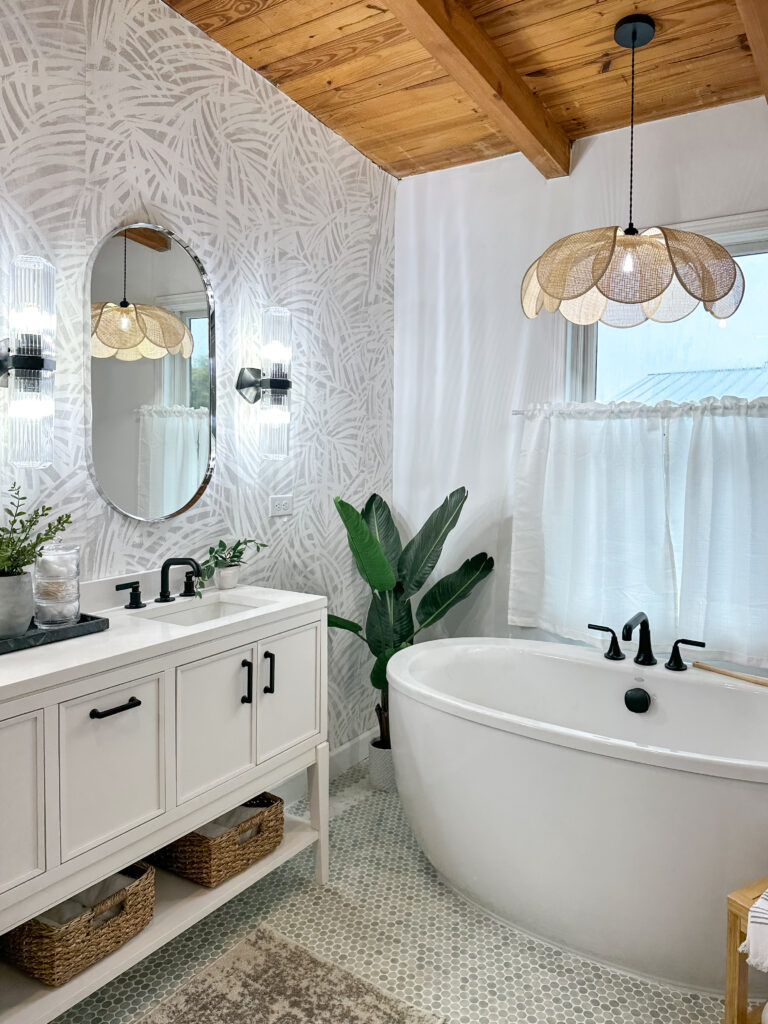
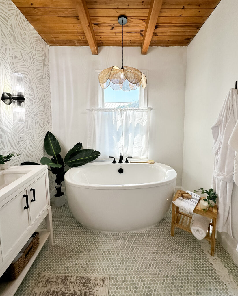
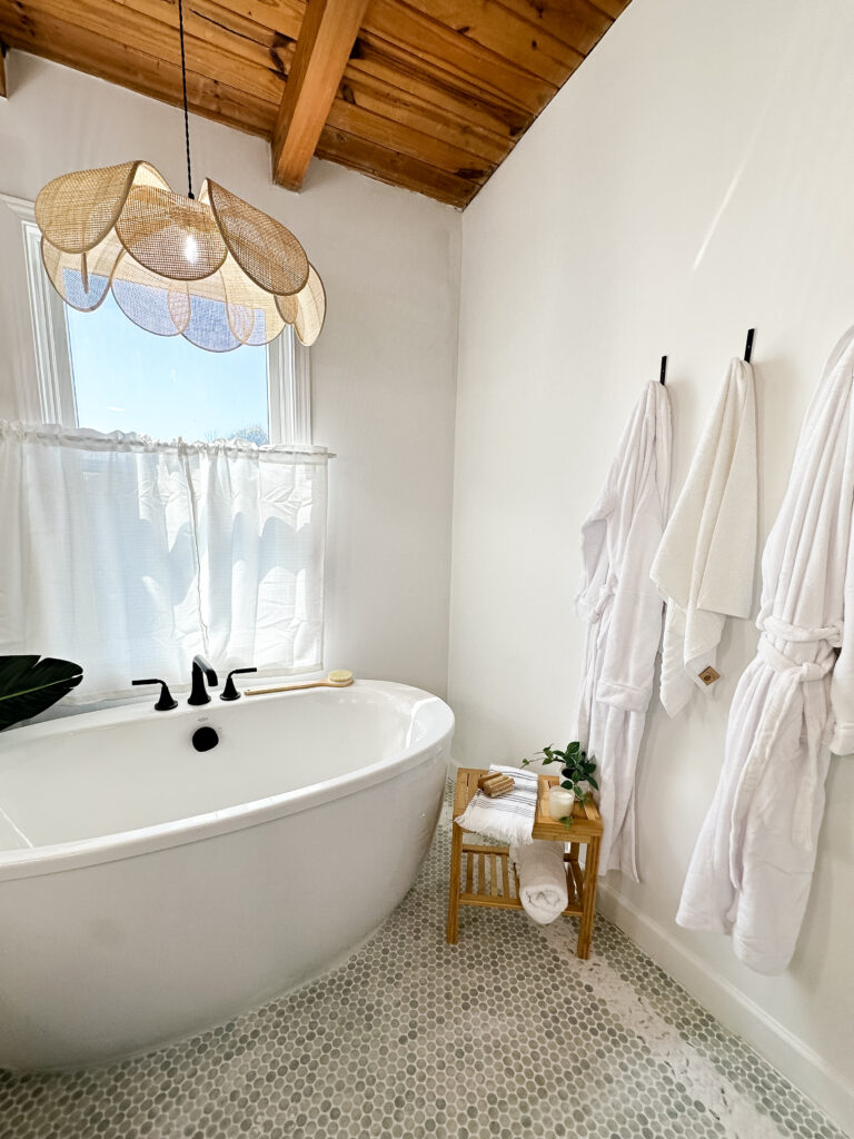
We had so many design choices to make with doing two rooms this week – not to mention we did ALL of the work besides plumbing, electrical and drywall ourselves! We really love how this main suite turned out and we were even more excited that… the judges loved it too!! HELLO FIRST WIN ON THE BEACH! Hopefully we can carry this momentum into next week and pick up another win!
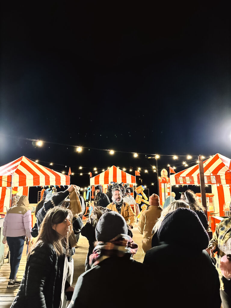
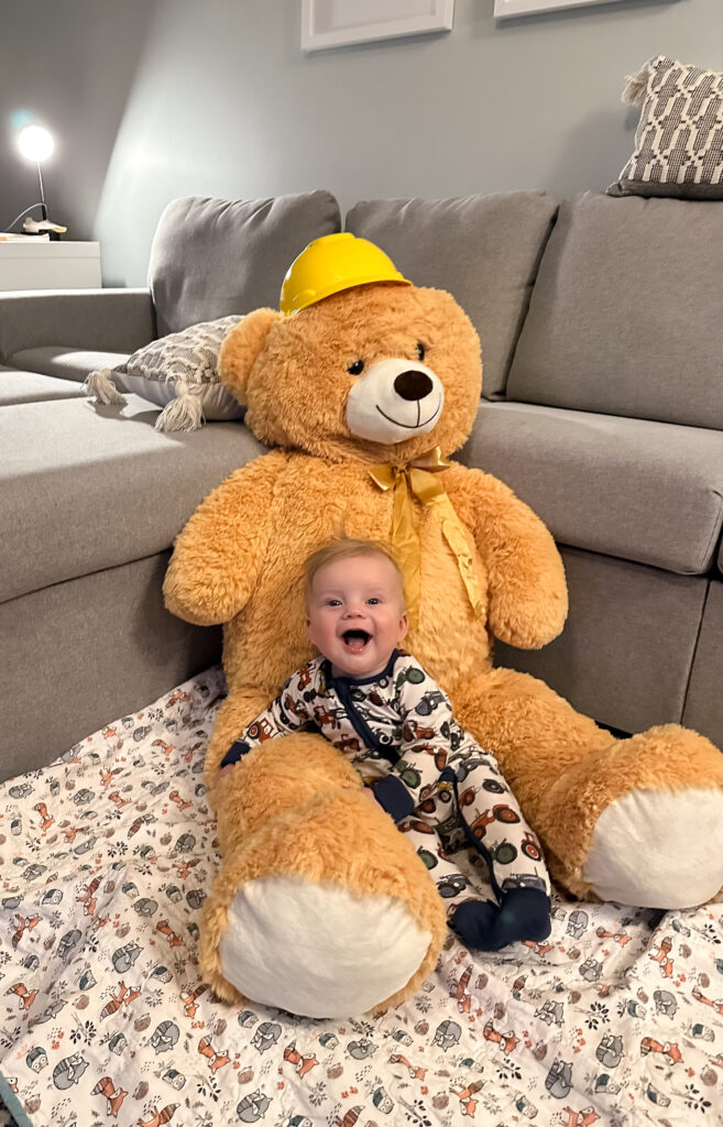
PS: Here are a few fun behind the scenes photos from this week!






BEDROOM SOURCES:
- Ceiling light
- Wall mural
- Bed frame/headboard
- Rug
- Bench
- Nightstands
- Lamps
- Curtains
- Curtain rod
- Curtain hooks
- Faux tree
- Paint (walls): Sherwin Williams Alabaster
- Paint (trim/ceiling): Sherwin Williams Whirlpool
BATHROOM SOURCES:
- Vanity
- Vanity hardware
- Mirrors
- Sconces
- Faucets
- Bathtub
- Tub faucet
- Tub light
- Floor tile (green)
- Floor tile (white)
- Shower tile
- Shower glass
- Shower head and sprayer
- Wallpaper: Astek Palmetto
- Wall paint: Sherwin Williams Alabaster
STYLING ITEMS:
- Serving tray
- Small clock
- Duvet insert
- Duvet cover
- Throw blanket
- Throw pillows
- Lumbar pillow
- Faux flowers
- Faux plant
- Styling books
- Bathroom tray
- Bathroom canister
- Soap dispenser
- Under cabinet baskets
- Bath mat
- Bathtub table
- Wooden brushes
- Bathtub brush
- Towel hooks
- Robes
- Cafe curtain
- Cafe curtain rod
- Faux banana tree
I loved your bathroom!! Could you let me know which color of the shower tile you used? It is hard to tell from the photos. You are so talented!
What color grout did you use with the penny tile bathroom floor? I am also using the Seafoam Mist Penny tile but the website says to use Cavern Moss but I like the lighter color. Thank you